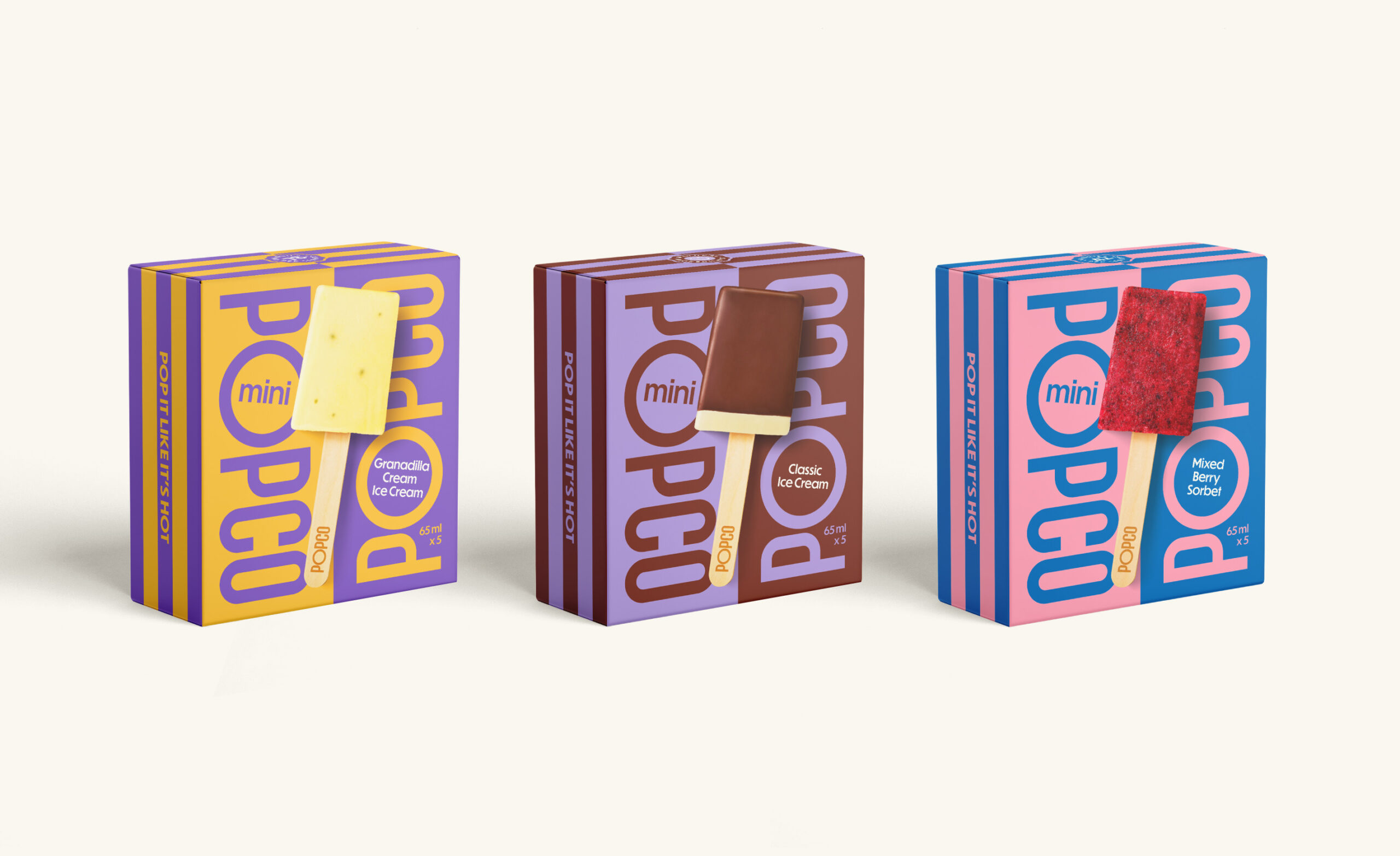
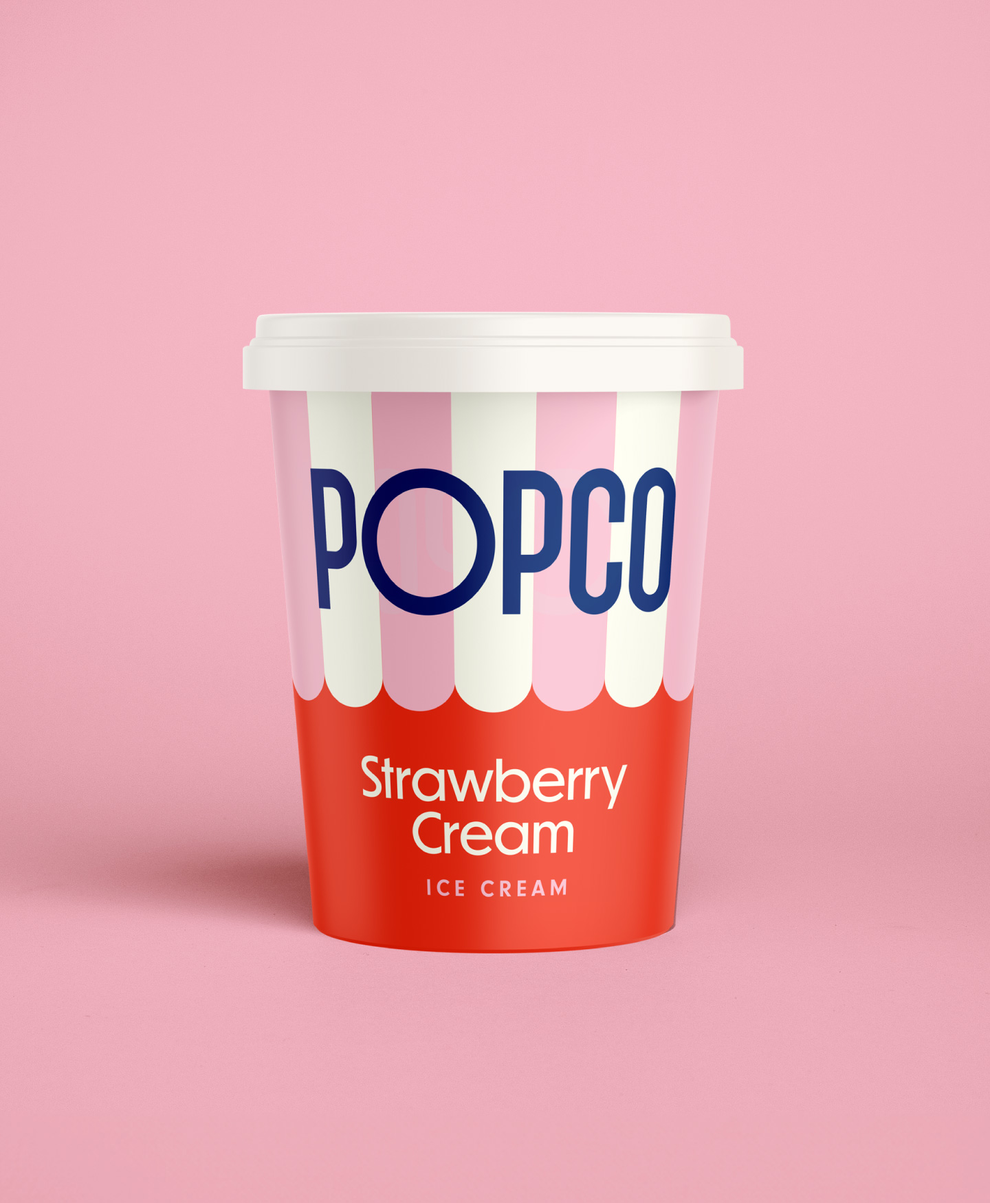
Monday originally developed the POPCO identity, establishing a bold and playful brand centred around colour, typography and the unmistakable POPCO wordmark. As the business evolved and prepared to launch its Mini Pops into retail, we were asked to revisit the brand and develop a packaging system capable of scaling across a broader product range.
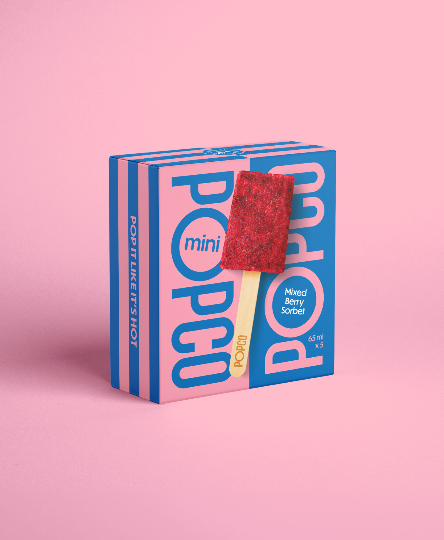
The resulting design language builds on the clarity of the original identity, using strong colour blocking, oversized typography and flavour-led palettes to create immediate shelf recognition. Each variant is defined through a confident pairing of colour and product descriptor, allowing the brand to remain highly distinctive while accommodating an expanding portfolio.
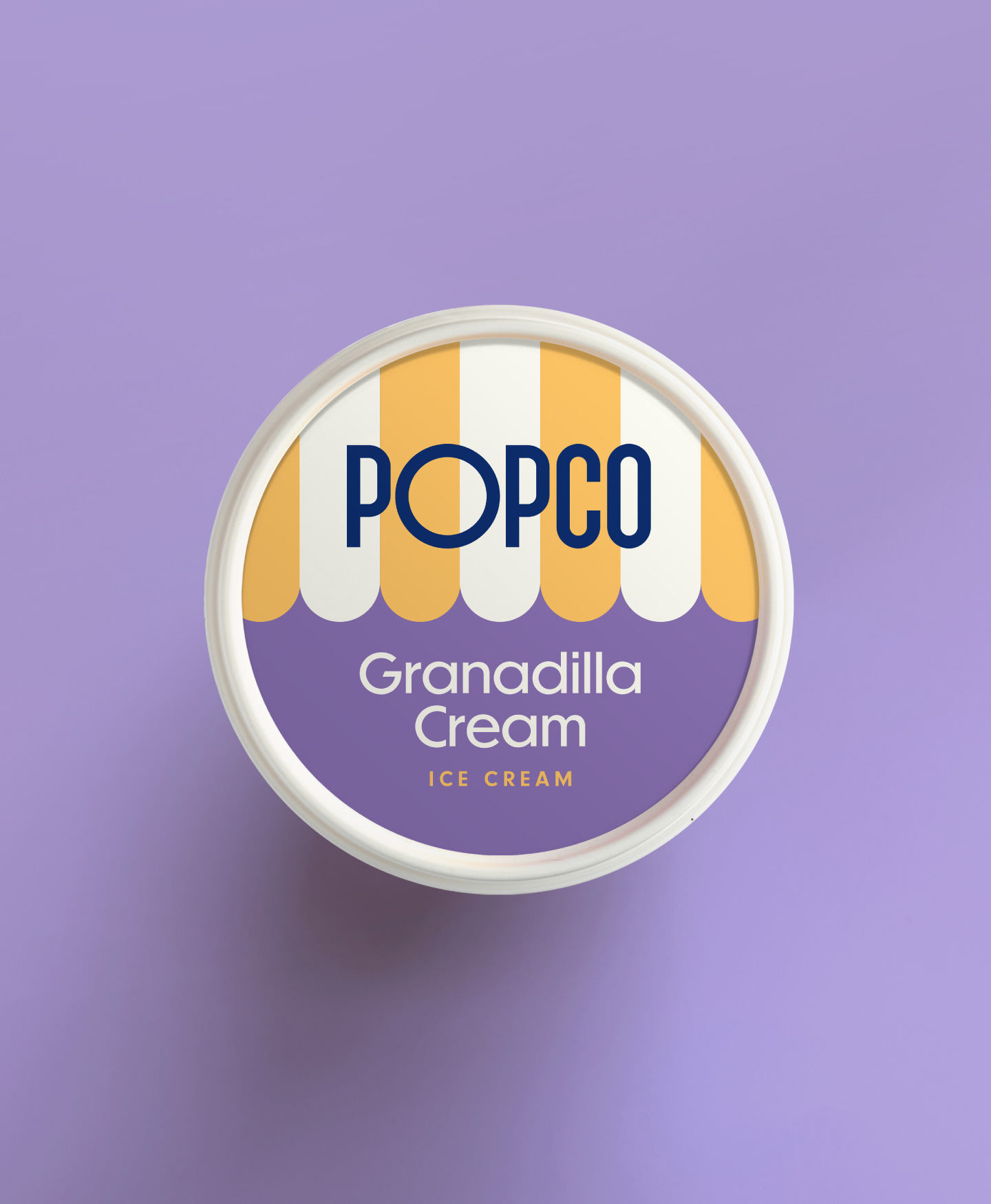
The system was extended to support the launch of POPCO’s first ice cream tub range. The design introduces a striped canopy motif inspired by classic ice-cream parlours, bringing a subtle note of nostalgia while maintaining the clean, graphic character of the brand.